6.3 Breaking Colours
Almost the opposite of glowingness are broken colours, or the act of breaking colours respectively. The word ‘to break’ can be taken literally, as it means that the intensity of a colour is reduced by mixing it with another one. Our anonymous author recommends broken colours in order to avoid the strong contrasts of steting: ‘Lay all your colours breaking them so that they may not stett.’1
Though Dutch authors began to write about both breekingen der verwen (‘breaking of paints/colours’) and breekingen der koleuren (‘breaking of colours’) only in the second half of the 17th century, the first mentions in Britain around the mid-century were made by persons with either Netherlandish roots or a firm linkage to the Low Countries. Since hardly any art literature was produced in the Netherlands at this time, it cannot be ruled out that it was used in Dutch art terminology before it reached Britain. An English origin, on the other hand, is doubtful, since Norgate used the phrase in the second, but not the first version of his treatise, which suggests that it does not seem to have been around in English in the 1620s.
Another indication that broken colours seem to have been common parlance among painters is that the few records we have, rarely explain what is meant by the expression. Cornelis Jonson van Ceulen (1593-1661), a painter of Dutch origin who was born and brought up in London, used the phrase repeatedly. Jonson received his training as a painter in the Low Countries, and together with his skills, he would have brought along workshop terminology, had he learned it as an apprentice. It was probably him who added an instruction about ‘breaking’ the poisonous golden-yellow pigment orpiment for shadows in the famous De Mayerne manuscript.2 Jonson was also the source of information on how to paint white and blue draperies with oil colours in another record, set down in a manuscript by the engraver Daniel King (1616-1661) in the 1650s. For linen draperies, he recommends to use ‘white and ochre a little broken with bone black’.3
King’s advice is clear on the pigments to be used. The instructions given by our anonymous writer are similarly specific. He explains that breaking colours should be done ‘with such colours as are of middle power and serve just to add a small alteration’.4 In order to make a mixture lighter, he recommends to add nothing but white, to darken it, blue black, to make it ‘fouller’, that is brown and earthy, cologne earth, and to add glowingness, red.
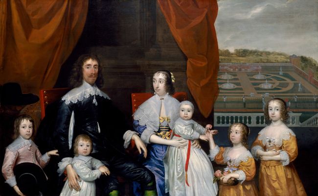
A family portrait of The Capel Family of around 1640 by Cornelis Jonson may help to illustrate different instances of broken colours [9].5 The painting depicts a lively family setting featuring the royalist Arthur, first Baron Capel (1604-1649), and his wife, Lady Elizabeth Capel (d. 1661), seated on heavy chairs covered with red velvet. The couple is surrounded by their offspring of two girls and three boys. The youngest, Henry (1638-1696), still a toddler, is sitting on his mother’s lap, while his sister Elizabeth (1633-1678) is trying to keep him entertained by showing him a rose from her flower basket. The family is placed in an architectural setting with square stone pillars, covered by a red curtain, while on the right-hand side, a view opens to their baroque garden at Hadham Hall and a cultivated park landscape in the background, alluding to the family’s horticultural interests and displaying at the same time their landholdings. Jonson may have used methods of breaking his colours that our unknown author recommended. It is likely that the garden in the distance was reduced in tone and intensity of colour by adding white to the dark greens of the bushes, the ochre of the sandy ways and even the red-brown of the brick walls. The Nuremberg painter Joachim von Sandrart (1606-1688) who had learned in Utrecht with Gerard van Honthorst (1592-1656), explained in his Teutsche Academie der Edlen Bau- Bild- und Mahlerey-Künste of 1675 how light and broken colours should be used in the background to create an impression of distance.6 This advice may be more useful for prospects than the anonymous writers’ preference of white.
Concerning black, if Jonson broke any colours to make them darker, he used it sparingly, especially in the faces, arms and hands. The white collars of the sitters’ clothes appear to be painted in the way recorded in King’s notes: especially at the rounding of shoulders, the white of the fabric assumes a visible ochre hue, perhaps shining through from the underlying dead colour, and a little black is added in the shaded parts.7 In the shadows on the velvet of the chairs, the carpet on the table behind the chairs, or the light pink gown of young Arthur, Jonson seems to have used brown and black. In the reflections on the skin of the faces and arms, but more distinctly in the taffetas of the yellow dresses of the girls and the red curtain, red was used, as in the suggestion of the anonymous writer, to add a glowing effect.
In order to avoid unwanted effects of broken colours in the painting of flesh colours, the unknown author urges his readers to keep their brushes charged with a mixture of light flesh colour, the ‘carnation Pencills’, away from dark paints, especially from ‘blew black’.8 He recommends a mixture including this pigment, but in minimal proportion, for ‘broaken fleshes’ of the shaded parts.9 Daniel King’s manuscript of the 1650s gave similar advice, speaking not of ‘broken fleshes’, but instead of ‘blueish shadow mezzotint between the deep shadow and the flesh colour.’10 He recommended using coal black, a piece of information he claimed to have from Van Dyck. The idea was to evoke the effect of the veins appearing faintly blue shining through elegantly pale skin.11 Both King and our unknown author suggested the blue pigment smalt as an alternative for the purpose of rendering these bluish shadows.12 Yet, Van Dyck’s reputed choice of colours seems to have been more common in Britain. The Irish painter William Gandy (1655-1729) who, when in London, gained some insights into painting practices by the most prominent portrait painter of his day, Peter Lely, reported that Lely ‘breaks his flesh with lampblack, but the best way is to break the linen with pine black or charcoal black.’13 He noted that Lely used black in the incarnate rarely and only for portraits of most tender ladies, since he kept having to transfer it to ever new palettes without using hardly any of it. This suggests how little of the pigment was needed to break flesh colour. In a portrait of Elizabeth, Countess of Kildare of 1679, we may observe the effect of Lely’s careful breaking of flesh colours with black in her décolleté, her left hand holding a branch with orange flowers and foliage, and the faint shadows around the corners of her full lips [10].14
9
Cornelis Jonson van Ceulen (I)
Portrait of Arthur Capel, 1st Baron Capel (1604-1649) with his family, c. 1640
London (England), National Portrait Gallery, inv./cat.nr. NPG 4759

10
Peter Lely
Portrait of Elizabeth Fitzgerald (née Jones), Countess of Kildare (1665-1758), c. 1679-1680
London (England), Tate Britain, inv./cat.nr. T00070
To my knowledge, in British writings on art the expression to break colours was used exclusively in the context of practical instructions rather than in discussions of aesthetic effects. Talk of broken colours seems to have been common in the middle of the seventeenth century, but in art writings towards the end of the century it was hardly ever mentioned. In the Netherlandish art literature of the late seventeenth century, however, broken colours became almost synonymous with middle tints, the hues applied between the extremes of either light or shade or two different colours. In Britain, conversations about broken colours seem to have remained confined to the artists’ workshops, while on the continent, the phrase became part of a theoretical art concept. This observation of what appears to have been a common expression at the time may be another indication that the anonymous British Library manuscript dates from closer to the mid-century rather.
Notes
1 London, British Library, MS Harl.2337, fol. 10r.
2 London, British Library, MS Sloane 2052, fol. 152r; Berger 1901, no. 331.
3 London, British Library, MS Add.12461, fol. 48v. The spelling of this and the following quotation of this manuscript has been modernised. Talley 1981, p. 207, 223-224; Hearn 2015, p. 63.
4 London, British Library, MS Harl.2337, fol. 60v.
5 Hearn 2015, p. 45-46.
6 Sandrart 1675-1680, i.III, p. 70; Kern 2016, S. 195.
7 Hearn 2015, p. 63.
8 London, British Library, MS Harl.2337, fol. 9r. Talley 1981, p. 398.
9 London, British Library, MS Harl.2337, fol. 51v.
10 London, British Library, MS Add.12461, fol. 44r-v.
11 Talley 1981, p. 207-08; Taylor 2011, p. 72; Leonhard 2017, p. 170.
12 London, British Library, MS Harl.2337, fol. 52r.
13 London, British Library, MS Add.22950, fol. 21r.
14 Jones/Townsend 2005; Van der Hoorn/Wylder 2013, p. 11-12.