6.1 ‘Steting’: A Dutch Word for Strong Contrasts
The unknown author was himself probably not Dutch, for he only identified a single word for his Dutch glossary [1]. We can easily see that he must have intended to make a longer list, as the layout of the page, the text at the upper edge followed by blank space for more entries, and the fact that he speaks of ‘Dutch words’ in the plural, indicate. Steting, the single word in the Dutch glossary, is curious enough. The entry reads: ‘As to stet, is Hard, or steting is Hardness.’1 The Dutch ‘hardigheid’ was used in Netherlandish art treatises, but in a different way than our anonymous author employed ‘stet’.2 The word ‘stet’, in fact, is not a common Dutch word; I have not been able to find it mentioned in any Dutch etymological or historical dictionary. However, the Oxford English Dictionary lists it as ‘stete’ and describes it as a term, obsolete since medieval times, which is related to the Dutch ‘stooten’ and apparently also translated akin to ‘to bump, to knock or strike’.3 Given the archaic classification of the word in both cultures, we have to take the anonymous author’s word for it and assume that it entered or re-entered English as a painterly term from the Dutch. In the context in which the word is mentioned in the manuscript, it has to be understood as something like a hard or strong contrast. It is often used with the preposition ‘against’, and the author translates ‘stet against’ at one occasion as ‘to stand hard against’.
The anonymous author deploys the term stet when he explains that in choosing colours, three points are important, their truth to the living model, their harmonious arrangement, and their agreeable appearance: ‘The height of colouring consists in these three things: First, that all the various colours that are seen in the life be expressed. Secondly, that they be all expressed in a harmonious agreement one with another. So that no one may stet (or stand hard) against any of the rest. Thirdly, that they be all expressed with a pleasant and delightful colouring’ [my italics]. 4
Regarding the third concern of ‘pleasant’ colouring, it is uncertain whether the author referred to an arrangement of colours he found matching or whether he worried about cleanliness of colours, which was an important issue to him. In the order of practice, in any case, one would probably first establish the colours after the natural models, then decide for their pleasantness, and only then aim for their harmonious combination, if the two last points can be separated at all.
The adjectives ‘harmonious’, ‘pleasant’, and ‘delightful’ describe effects of the ways in which colours are applied to the canvas or any other support. The same is true for the harsh contrasts of steting the author warned against. Abrupt contrasts can often be observed in copies of oil paintings, for instance after Van Dyck, but can also be found in paintings of high quality. Although the suggestions made in the early catalogue of the British Library regarding the author and his master are likely to be rebutted, Gerard Soest’s elaborate Portrait of Lady Borlase may serve as an example to discuss and visualise effects of steting [2]. The way in which the sitter appears silhouetted in front of the landscape may be an instance of steting, for the painting is either not finished or the background was outsourced and treated in a visibly economical way. After all, the portrait was painted in the 1670s, when even high-quality portrait painting had become a rather rationalised process in many British and British-Netherlandish workshops.5
In Lady Borlase’s face, we can observe how colours were merged and how they were contrasted. Our unknown writer put forward some practical advice regarding the use of pigments for flesh colours, which would match the face colours of the portrait. The manuscript reads: ‘[i]n fleshes you must use yellow ochre plentifully and red not sparingly, I mean in the carnation fleshes’.6 Soest used ochre and red pigments in the lady’s cheeks, as well as in the shaded areas of the face and the cast shadows of the pearl necklace. It helped him to achieve a healthy-looking complexion and to merge the colours avoiding abrupt transitions between the different hues. This may be an example of their ‘harmonious agreement’ that the author wished for, but the effects also result in spatial illusion of the woman’s face. The illusion is broken at the parts of the outlines of the headdress, where the colours of the hair, the underlying brown-grey dead colours and the colours of the sky and clouds are juxtaposed.

1
Directions for Painting and Drawing
Courtesy of the British Library Board, BL MS Harl.2337, fol. 48v.

2
Gerard Soest
Portrait of Alice Bankes, Lady Borlase (1621-1683), c. 1672-1675
Washington (D.C.), National Gallery of Art (Washington), inv./cat.nr. 1977.63.1
3
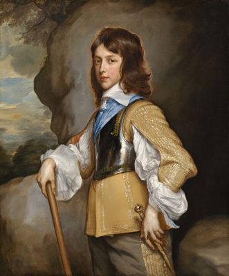
Adriaen Hanneman
Portrait of Henry Stuart, Duke of Gloucester(1639-1660), c. 1653
Washington (D.C.), National Gallery of Art (Washington), inv./cat.nr. 1937.1.51
4
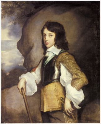
studio of Adriaen Hanneman
Portrait of Henry Stuart, Duke of Gloucester (1640-1660), after 1653
Ickworth House, private collection Marquess of Bristol
An earlier example may be the Dutch painter Adriaen Hanneman (1604-1671), who received his training as a painter by Daniël Mijtens (c. 1590-1647) in London and is believed to have worked as an assistant in Van Dyck's workshop subsequently. Hanneman developed a time-saving method of leaving transitions around the sitters’ heads to the layer of dead colouring which could be described as stet; indeed he seems to have made this into something akin to a personal hallmark. The Portrait of Henry Stuart, Duke of Gloucester, when aged about 12, illustrates Hanneman's signature style of a halo-like effect [3]. He achieved it by leaving parts of the underlying dead coloring visible between the young duke’s shock of hair and the background painting. Similar effects can be observed between the face and the hair, around the hands, and on the edges of the right sleeve. Yet the portrait does not appear to have been executed hastily, since these instances of what might be called steting are contrasted with more elaborate treatments of the face and hair, as well as the careful rendering of the various textiles and the metal of the armor.
That this effect of non-finito was neither accidental, nor easy to achieve, is suggested by a comparison to a copy of this painting perhaps by a member of Hanneman’s studio [4]. The copyist was able to achieve the outline-like quality of the parts around the wide sleeves of the Henry Stuart’s voluminous shirt, but he either failed to render the more glowing effect around the boy’s head or he forewent to copy it.
The discussion demonstrates that steting can be applied as an art critical term in a discussion of a painting and its qualities. Yet, it never made it into written English. The word that was preferred is of course ‘contrast’. It derives from the French and can be used universally for effects to be avoided as well as encouraged. Warnings against strong contrasts of colours and chiaroscuro are common in the early modern art literature of any origin.
Notes
1 London, British Library, MS. Harl.2337, fol. 1v.
2 Van Mander/Miedema 1973, vol. 2, p. 431; Miedema 1981, p. 121.
3 OED, ‘stete, v.’ [8 September 2023].
4 London, British Library, MS Harl. 2337, fol. 49r. The spelling and punctuation of this and subsequent quotations of the text has been modernised.
5 Talley 1981, p. 329-341; MacLeod 2001.
6 London, British Library, MS Harl. 2337, fol. 41r.